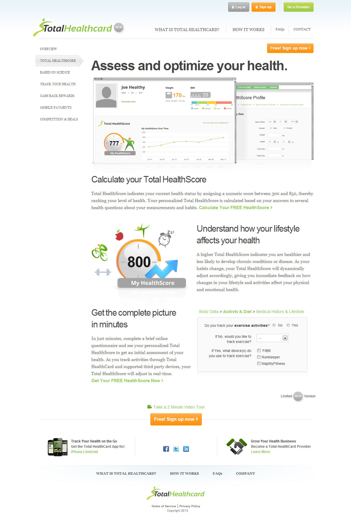
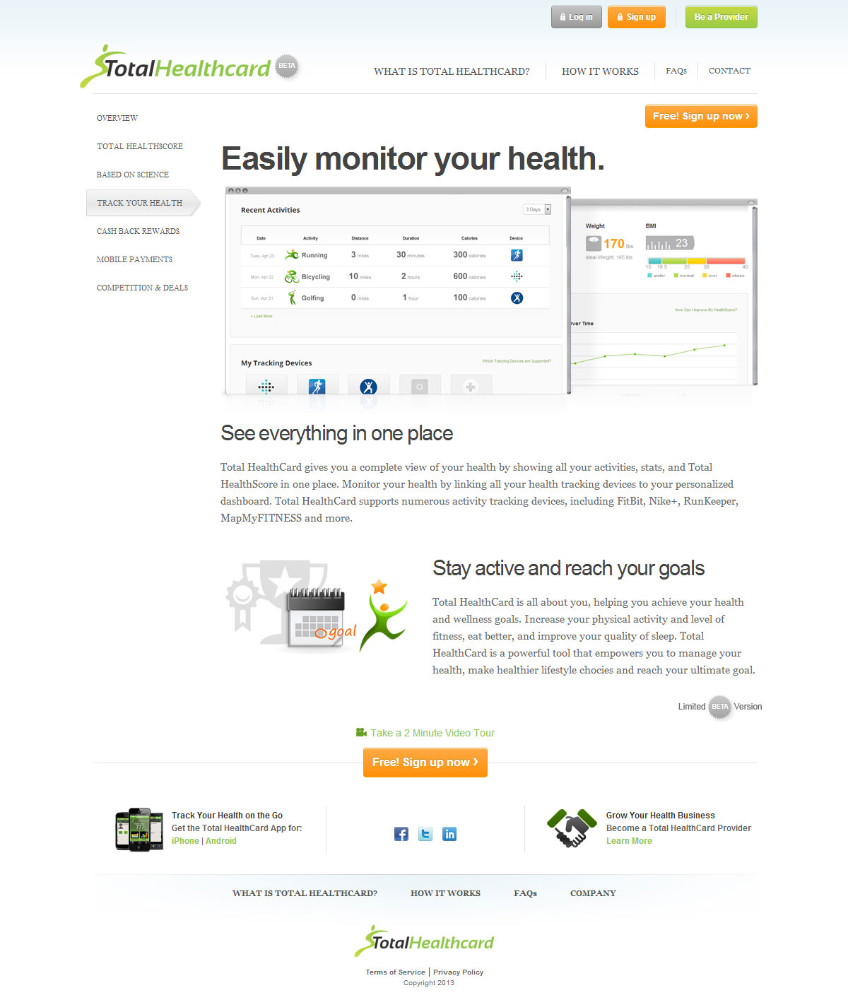
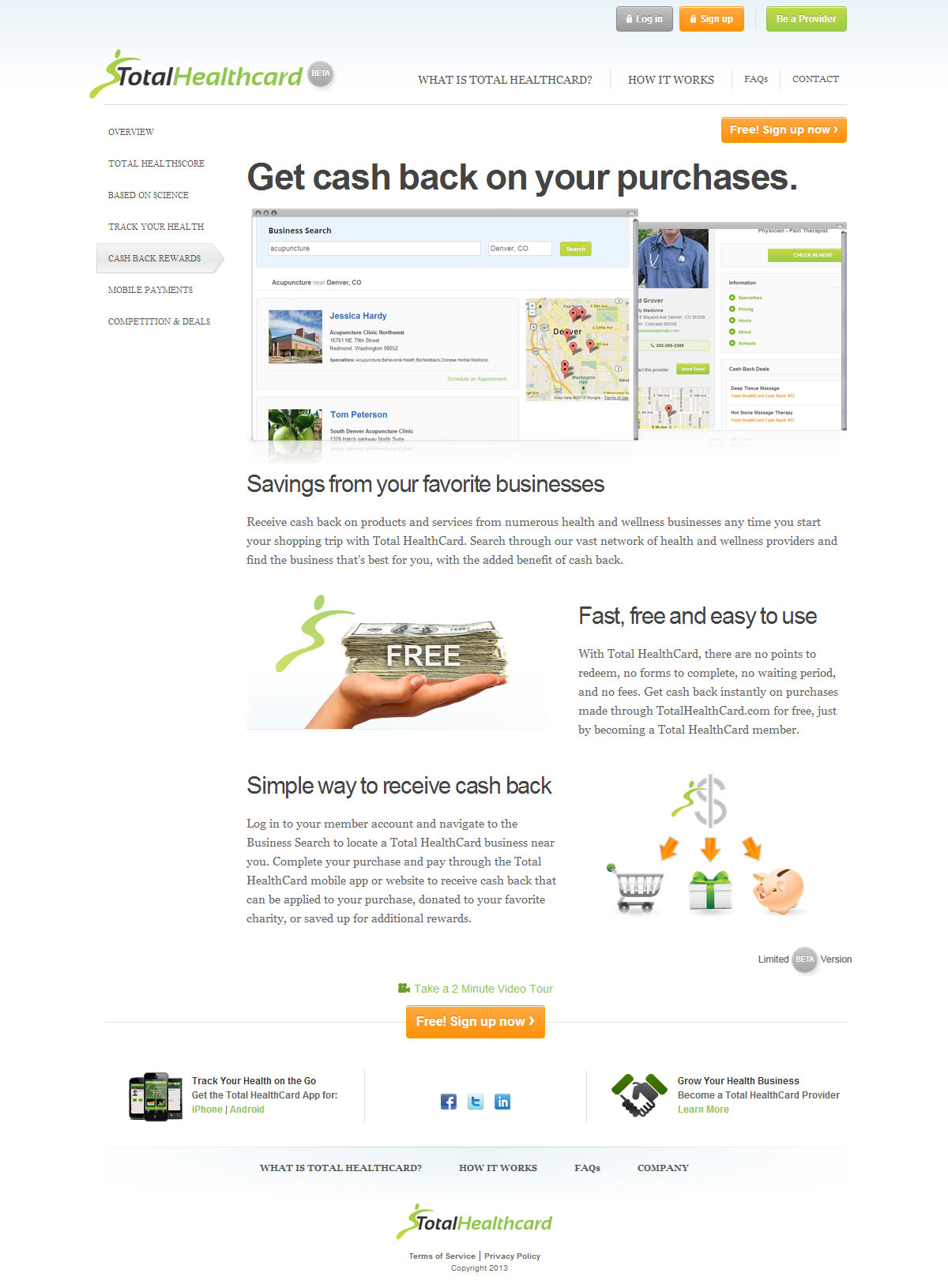
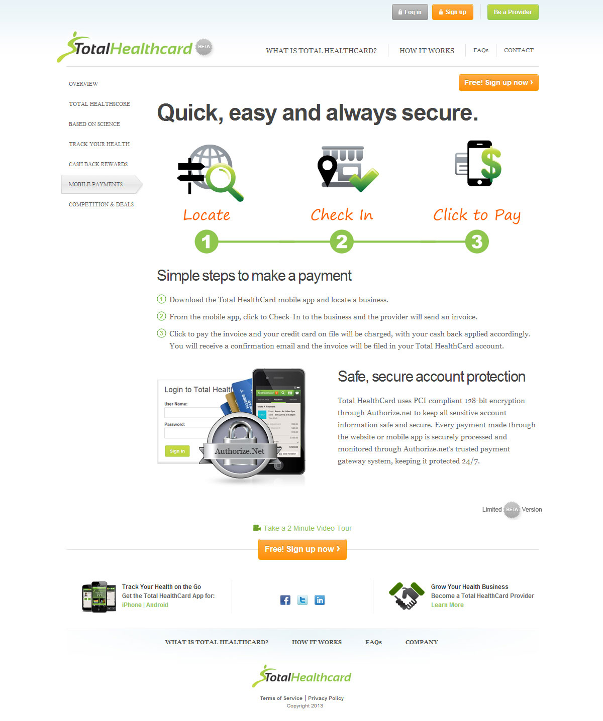
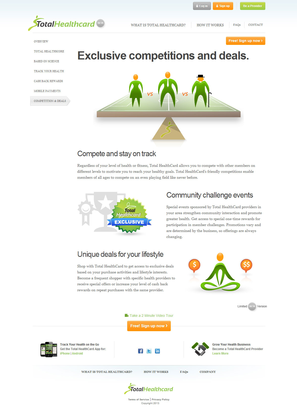
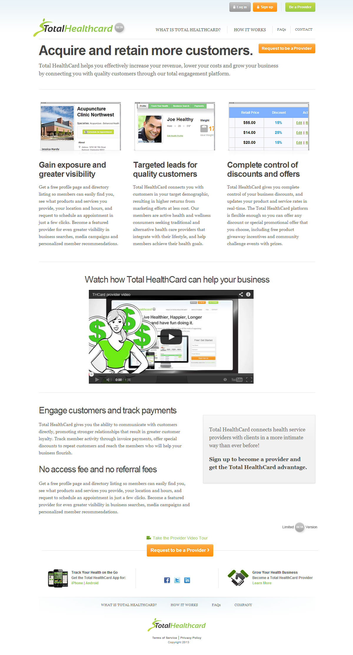
Launching a complex, new business idea that combines health tracking and scoring, an alternative wellness directory, and cash back rewards with mobile payment processing, the startup company needed a way to explain their offering, create a unified brand image and encourage members and providers to sign up.
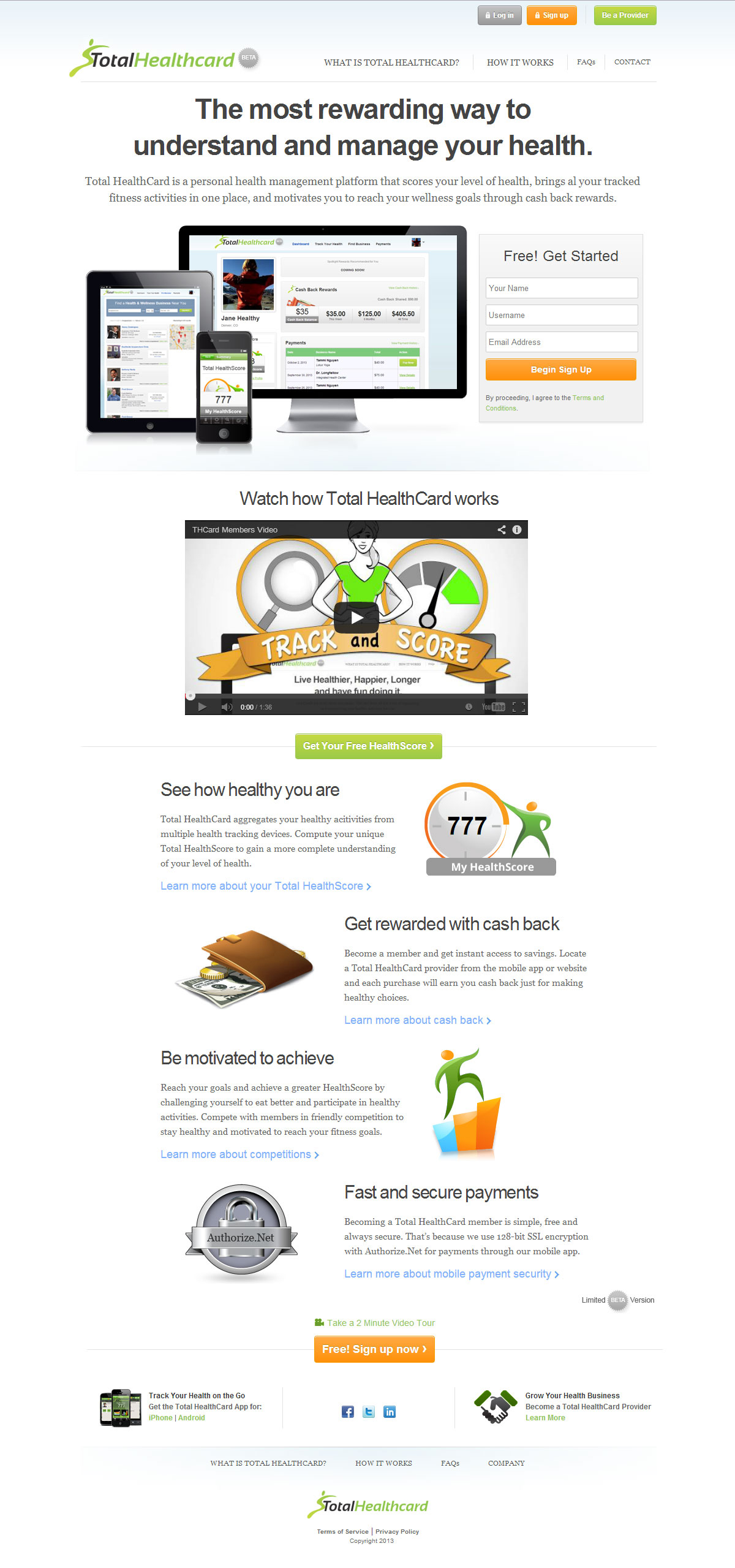
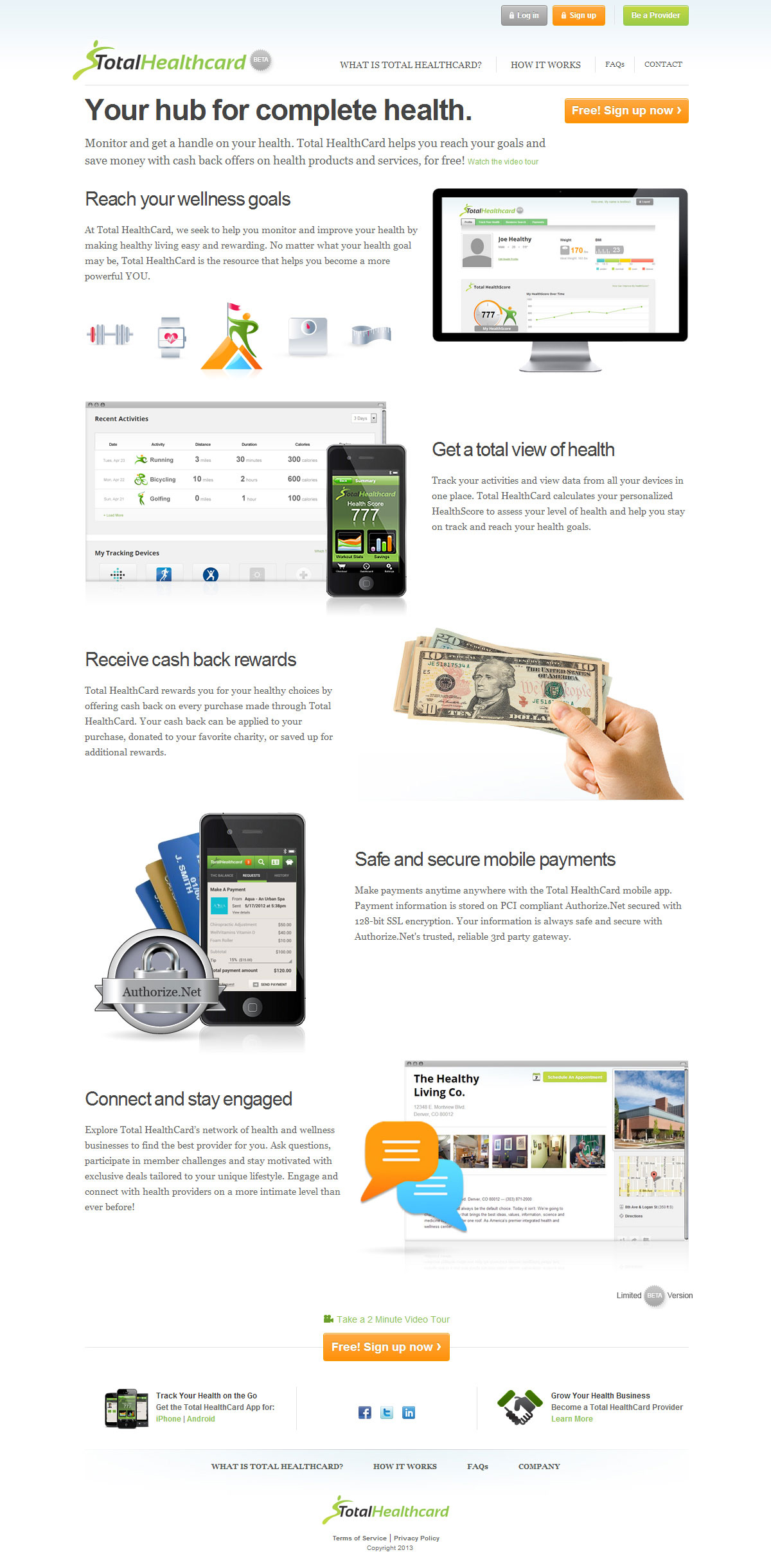
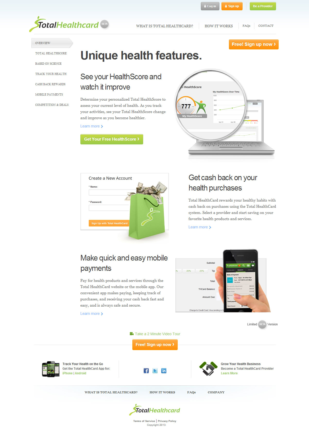
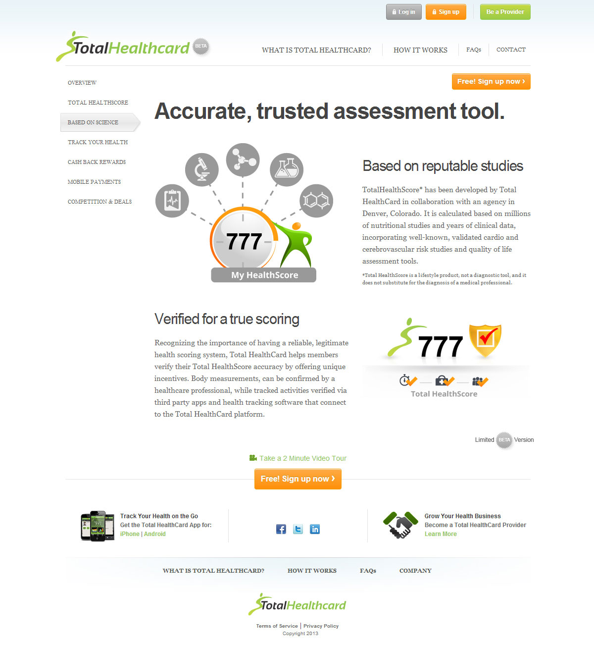
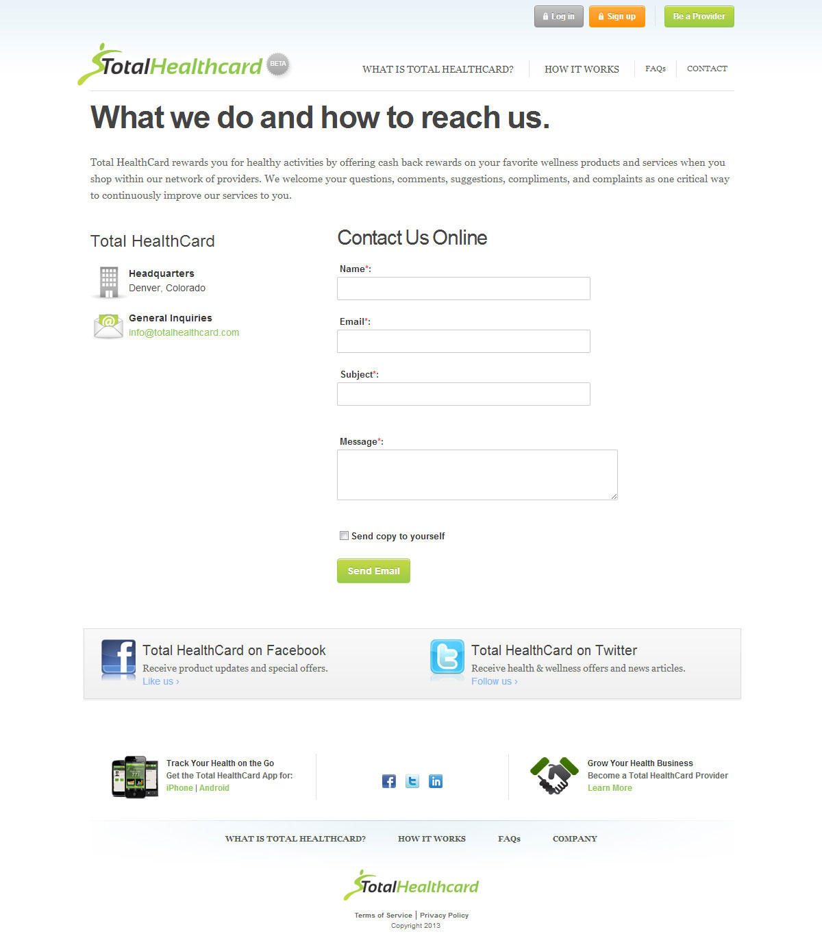
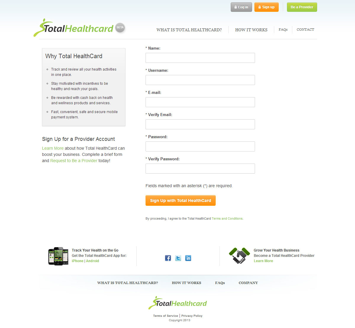
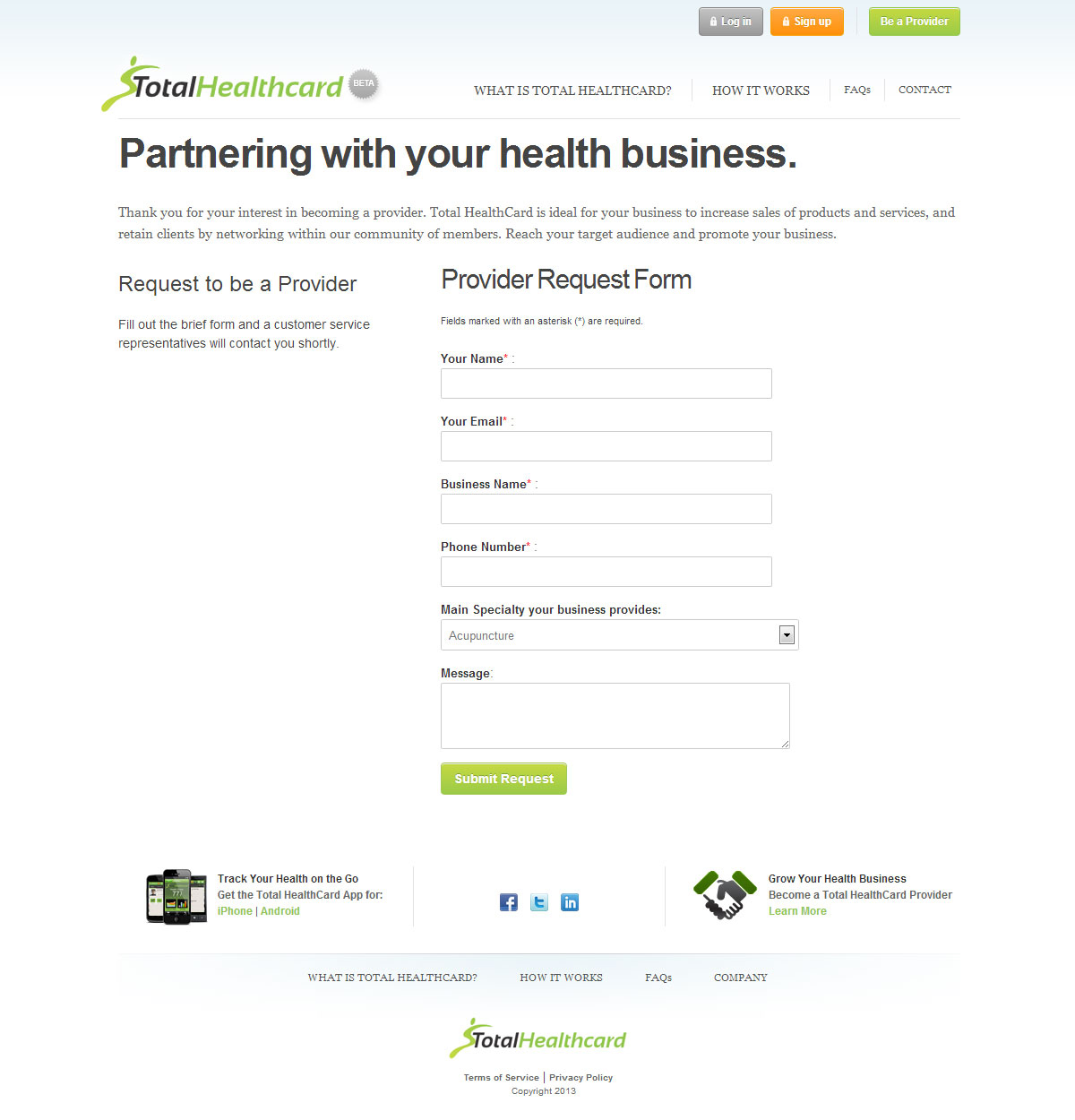
The first task was to take the complex and make it simple, by clearly stating what they offered, why it is relevant and valuable, and how to take action to become a member or service provider. This was explained through concise sales copy, supported by visual graphics and demonstrated via video. Each web page had a distinct call to action, while also clearly explaining the benefits provided for each type of user.
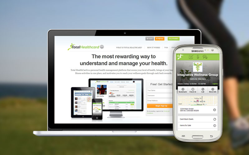
The website was the launching pad for defining the brand image, creating a fresh, open feel with colors that complemented their existing logo and desired design direction. The website was programmed to be responsive, creating a single experience across desktop, tablet and mobile devices.
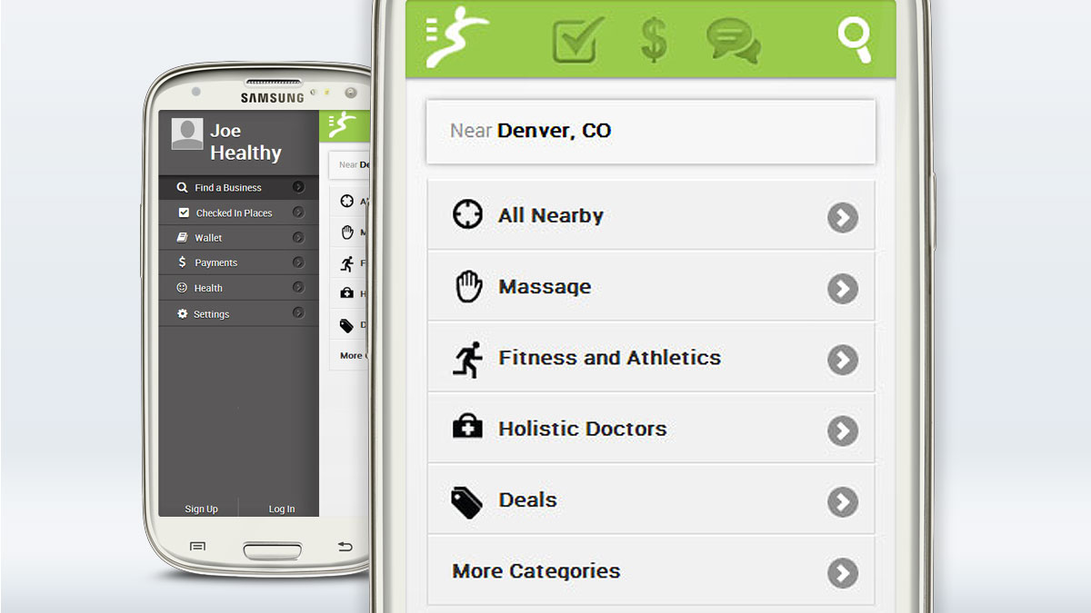
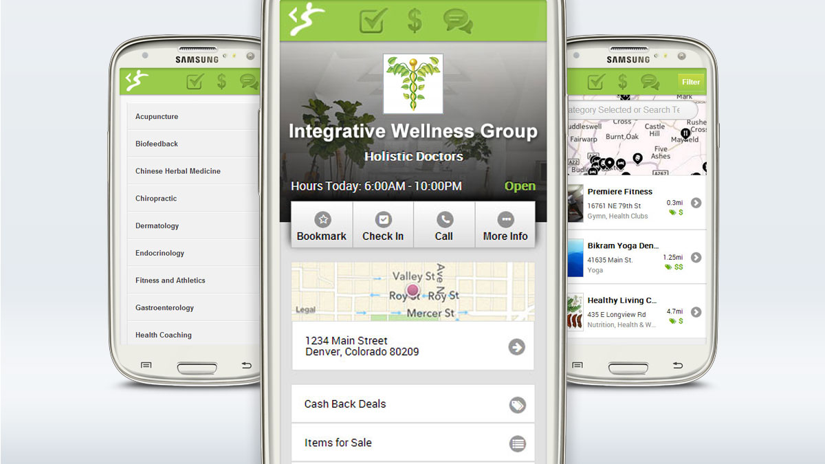
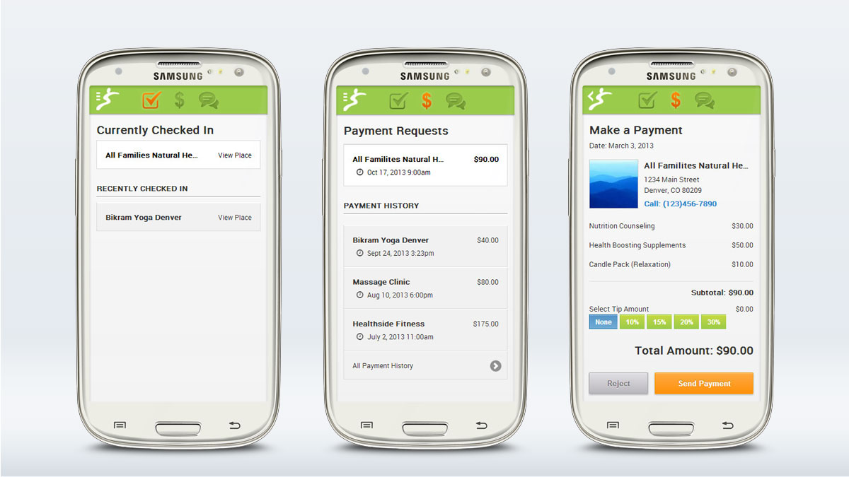
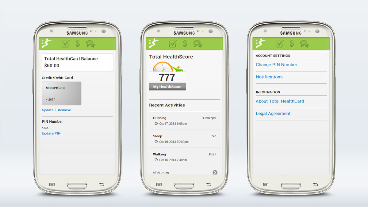
A mobile app was created with its primary purpose being for members to locate alternative wellness service providers, select a cash back deal, and make payments on location via the mobile application. The mobile app was designed to complement the clean, fresh look and feel of the website, while highlighting the distinct identity colors.
- Application Design
- Copywriting
- HTML/CSS
- Mobile App Design
- Mobile App Development
- Responsive
- User Experience Design
- User Interface Design
- Website Design
- Website Development


