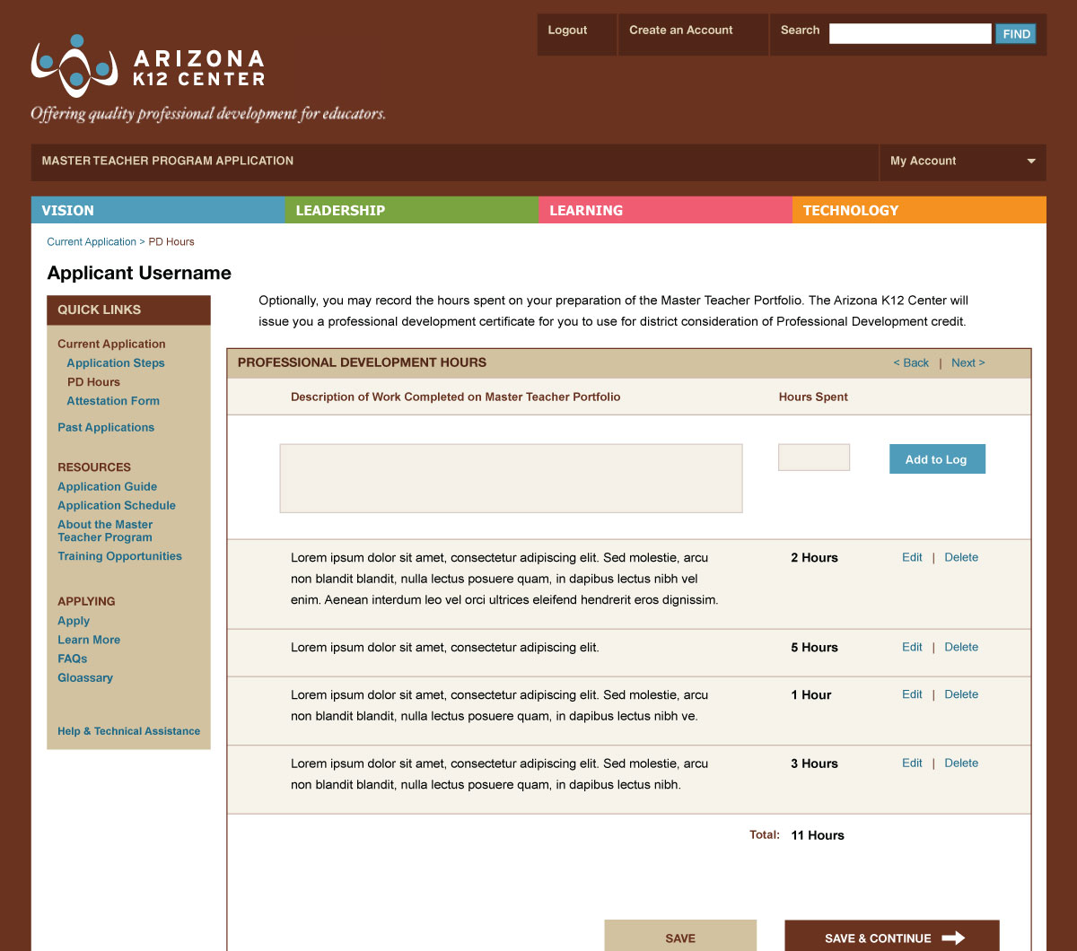
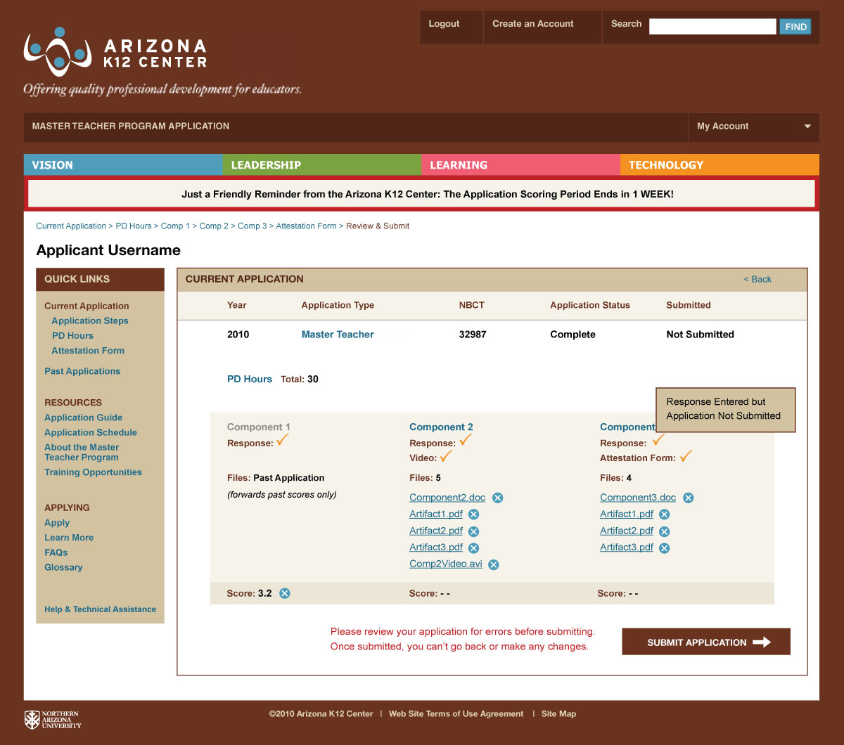
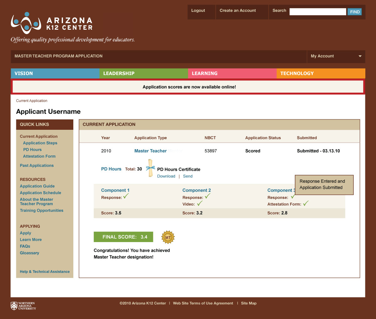
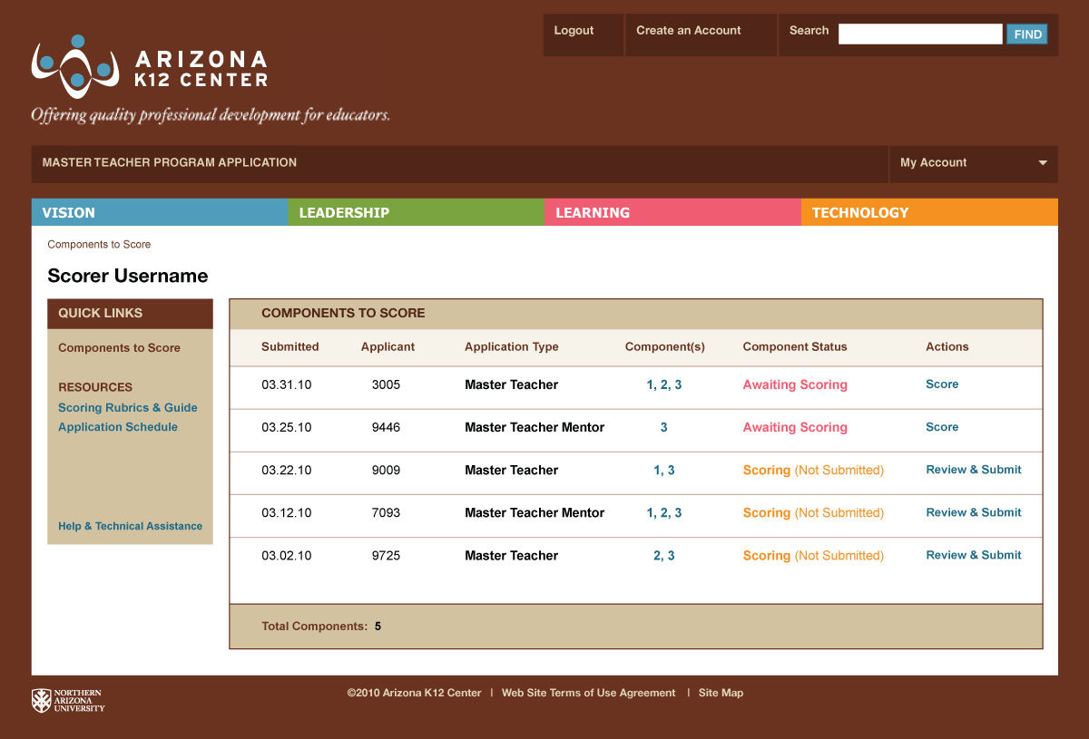
The challenge was to take a complex, physical application and design an online management system to simplify the process for applicants, scorers and administrators alike. User personas and flow diagrams were created to conceptualize the process and understand the necessary steps. The design followed the brand style guide and existing website, with each piece of data strategically organized and presented to create an intuitive experience.
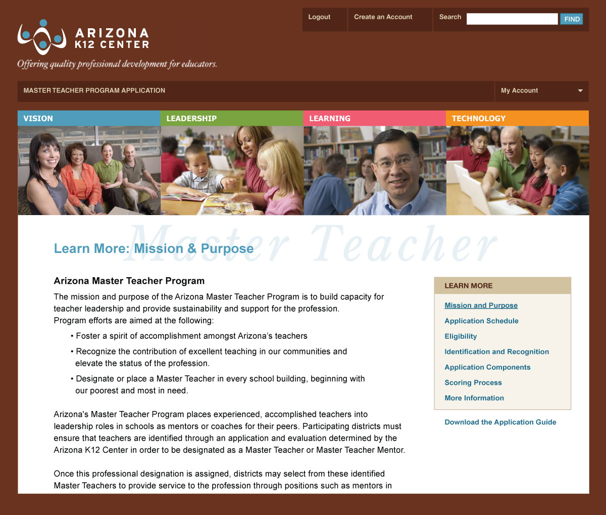
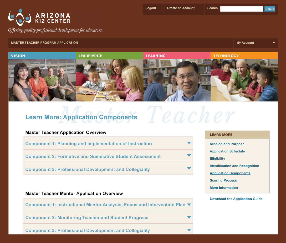
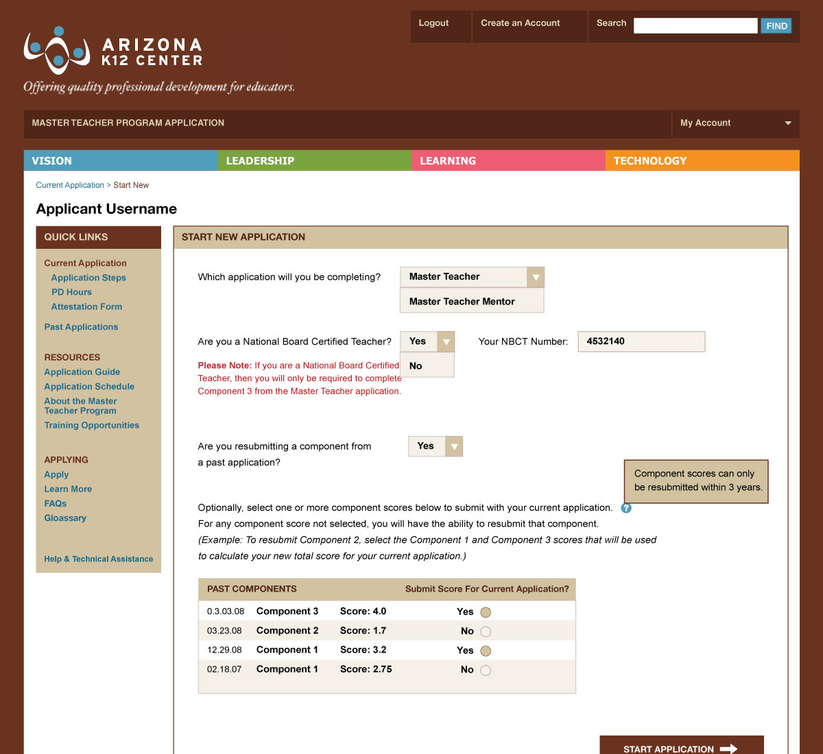
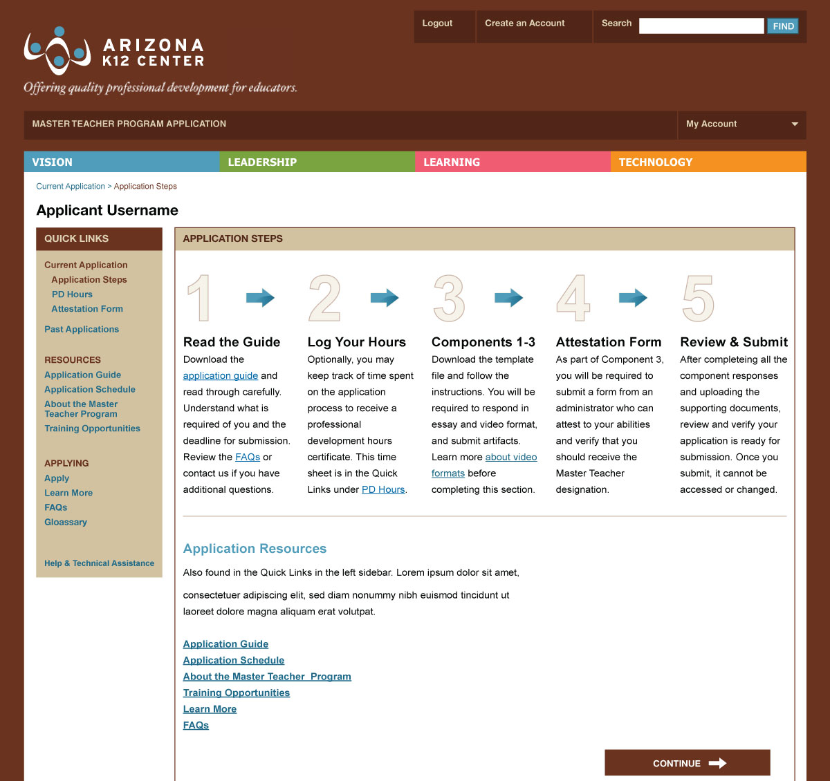
Before login, applicants were able to learn about the process, information required and benefits. Once logged in, the applicant is directed through the steps to complete the application, and each section is broken down into manageable components. They can easily upload documents and videos along the way, with previous versions being stored in the database for access from multiple computers over a period of months. Applicants can view their score from current and past applications to easily manage and monitor results. Resources are included to explain each step in detail.
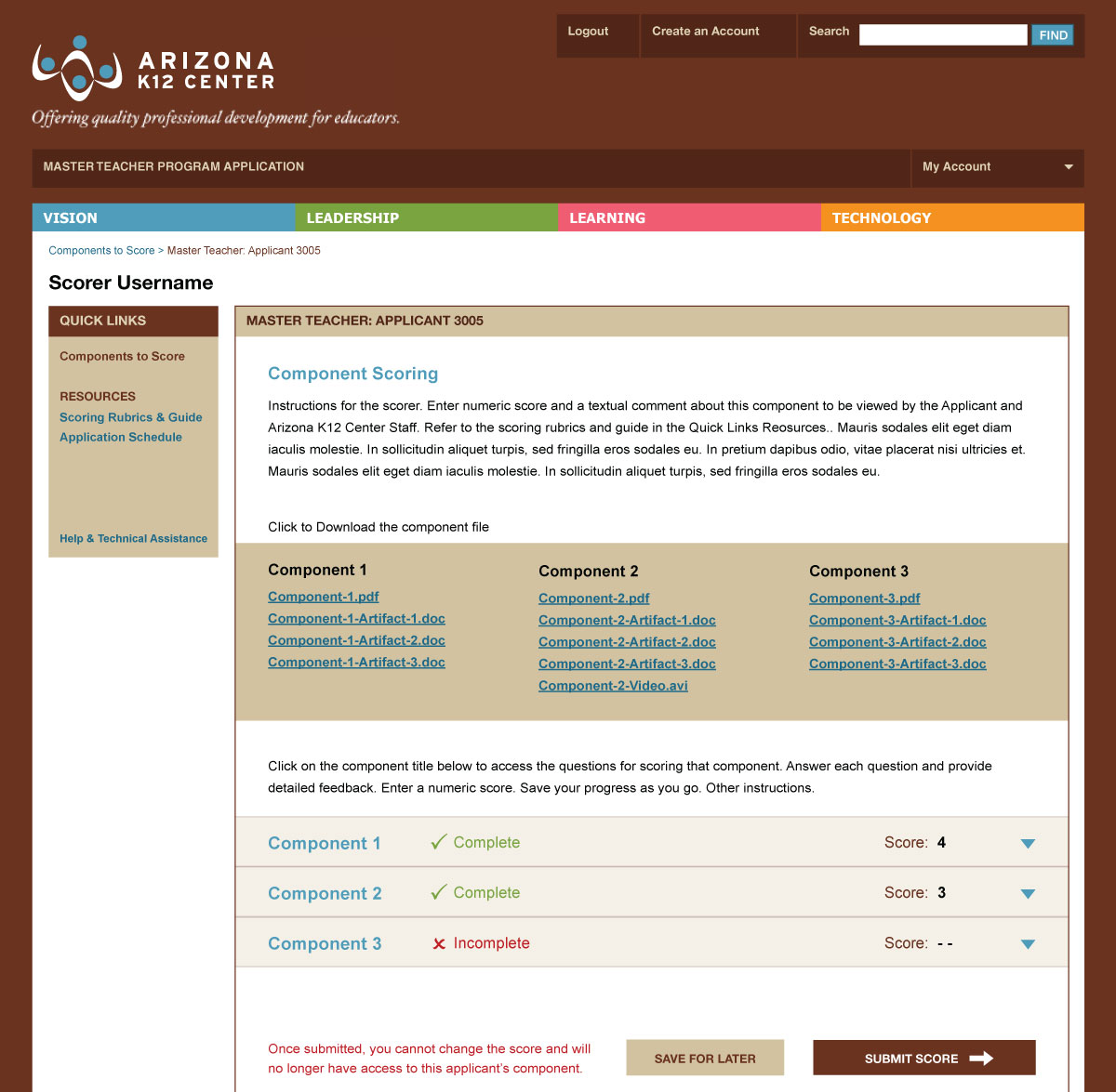
Once the application scoring period begins, scorers are able to download the application components for scoring and submit a score. The scores are weighted and averaged to calculate a final score for each applicant.
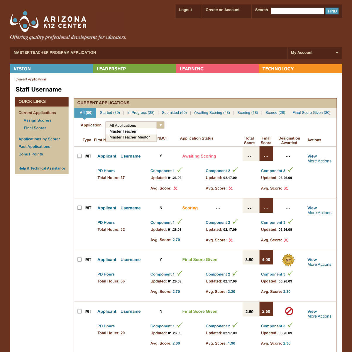
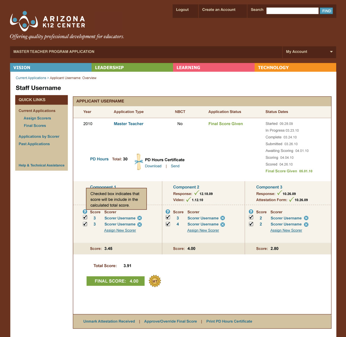
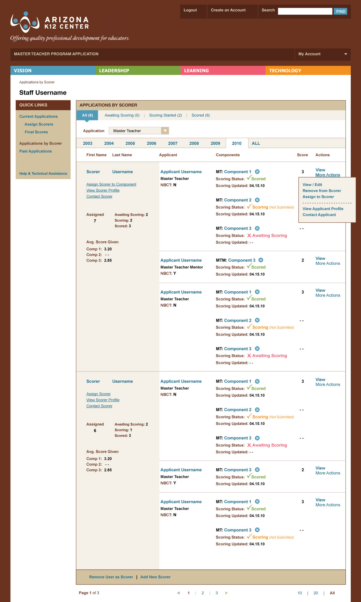
Administration staff are able to monitor the progress of every application started, as well as their status of scoring completion. Applications are sortable, searchable and documented at every step of the process. Staff are able to assign application components to each scorer, add notification messages by user type, and send emails to users by group or individually.
The intensive application process was simplified for greater efficiency through intuitive information design for each user interface.
- Information Design
- User Experience Design
- User Interface Design
- Website Design


